7. Yellow
The colour of sunshine and daffodils - a splash of warm lively colour to brighten a dark corner... in your room or in your life. It probably comes as no surprise to learn that yellow is connected with the intellect, thought, cheerfulness and optimism. Many of us rush out to buy that first bunch of daffodils to mark the end of Winter. Most of us feel better on a sunny day.
All the functions of the mind are stimulated by yellow, from getting bright ideas to the more complex process of logical rationalisation. Learning is aided and improved by the application of this colour, since it opens up the student’s ability to absorb and retain information, as well as stimulating new patterns of thought. Perception and attention to detail are usually improved by exposure to yellow environments.
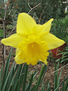
The truest shade of yellow, for Colour Harmonic purposes, is the clear bright shade of large-trumpet daffodils - not quite gold but very nearly. The instinctive reaction to this colour is one of heart-swooping optimism... the sort that has led more than one poet to wax lyrical!! The colour brings exhilaration and high energy equal in power to that of red energy, but having as one of its components a firm link with the mind. So, where red energy prompts physical activity, yellow prompts mental activity.
The colour stimulates reason, and rational thinking patterns, thereby creating a sense of curiosity and a need for mental stimulation. You’ll remember that red energy has a tendency to react badly when opportunities to be, to feel and to experience are limited; so yellow energy can abreact when there is insufficient stimulation - boredom arises easily, leading to frustration and irritability. Yellow is always at its best when intellectually challenged.
In addition to its marked mental effect, there is another aspect to yellow. It is the colour that we most regularly associate with light. Light itself, as we know, has no colour - or all of them at once. However, the fierce white light coming from our major source, the Sun, is altered when it passes through the gaseous atmosphere of the Earth. This atmosphere filters out a significant proportion of light entirely, so that it never reaches the planet’s surface - you will have heard that as the earth’s ozone layer gradually thins, more light is now reaching us, bringing with it a new crop of problems.
The light we perceive is not direct sunlight, but has been refracted and filtered by the many millions of dust particles in the air. As a result of these changes in the basic composition of the Sun’s light, we see a vaguely yellow-coloured light, which we call sunshine.
Most human have complex reactions to sunlight and to sunny days, often linking them inextricably with happy times in life, with joy, good health and enthusiasm. We are more cheerful on a sunny day, than we are in the rain. Sufferers of syndromes like Seasonal Affective Disorder and M.E. report good health throughout good summers, and worsening symptoms as Winter approaches, and the levels of ambient light begin to fall.
We carry our good feelings for sunshine over into our attitudes to the colour yellow. We make happy cheerful associations to the colour. So this bright tone often introduces optimism and hope.
Having said all this, yellow has its disadvantages too. For instance, over-exposure to a yellow environment will make it difficult to relax or switch off. The mental stimulation of the colour can tend to drive the mind into endless circles which go nowhere. It can be a highly irritating colour if unbroken by other, more soothing tones.
In addition to its tendency to accept boredom when the viewer is unstimulated, yellow without balance will tend to induce flightiness - being full of ideas and plans which never come to fruition because the mind never pauses long enough to bring its grandiose schemes into reality.
At its very worst yellow tends to sink into a morass of judgmental cynicism, becoming hypercritical and tart. Like red, yellow is a colour to be regarded with considerable respect, and used with circumspection. It has enormous power and importance, but must be evenly balanced in order to avoid some of the more negative aspects.
Lighter shades of yellow:
From lemon through to palest cream the lighter shades of yellow accentuate the cheerful, attentive, stimulatory qualities of the true colour. All of these tones are positive in their effects, with palest buttery cream providing the most workable alternative to white available to us.
Lemon is true yellow with a hint of white, and the tiniest touch of blue. It keeps most of the stimulation and intellectual quickness of the true shade. There is also an edge of analytical sharpness to the tone though, more objective evaluation, and perhaps somewhat less compassion.
As we all know the fruit version of lemon is sharp and astringent, and their juice cuts through grease and fat. The shade can, in a similar fashion, act as a cleansing agent which cuts away emotional blubber, getting to the heart of the matter. Where the effect of true yellow is to respond in a warm and sympathetic manner, the lemon effect tends to observe from a distance, developing an overview on any given situation, rather than entering into it. This is a scientist’s colour.
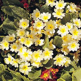
Take away the hint of blue, and add more white and we shall reach the gentler shades of primrose. Now we see a greater emphasis on the hopeful and joyous aspects of the true tone. These creamy rich shades typify our responses to Spring and Summer; once again we respond to the light we see in pale yellow. Primrose yellow holds within it promises of brightness, encouraging an expansive, outreaching attitude. We unfold, feeling secure and optimistic about the future.
At the lightest end of the colour range, we find the cream tones, where the pure qualities of white are touched by a hint of cheery optimism. This is the realm of the positive thinker, who is open to all types of new ideas, so long as they eventually surrender to logical analysis. Still, the link with the mental area is strong, though cream brings a more abstract approach to thought processes. Here we experience parallel thinking, rather than lineal.
These paler shades of yellow are healthy, encouraging the vitality we already have, and releasing healing power and inner strength when we are at a low ebb. All in all, they are valuable for their ability to generate happiness, contentment and hopefulness.
Darker shades of yellow:
There are, sadly, very few positive comments that can be made about the range of colours which lie between mustard and dark yellow. Although brown could be seen as the darkest end of the yellow spectrum, we shall deal with this shade in greater detail later.
Most of the tones in this group have depressing, negative psychological effects. There are several unpleasant associations which spring to mind - yellow jaundice, yellow-bellied, for instance.
Yellow is the spectrum colour which responds worst to the addition of black, or (if you prefer) the withdrawal of light. This might be because of our associations with yellow and sunlight, one of the most important forces in our lives.
Certainly most of the connotations of darker yellow shades are negative - jealousy, malice, resentment, spite are all dark yellow in expression. Almost all insects carrying the darker yellow and black banding on their bodies are capable of administering repeated stings - compare the stripes on a honey bee to those of a wasp, and you’ll find that the yellow stripe on the bee is several shades lighter than that of the wasp; and of course the sting of a honey bee can cost the bee its life.
Over-exposure to these colours will cause a gradual deterioration in health, because of their depressing effect. They can be particularly detrimental to observers whose general energy levels are already impaired, either by illhealth of (particularly) anxiety. They are also tiring colours to live with. The stimulant effect is still present in darker tones, but now the influence has no hopeful anticipation to guide its influence into positive channels. Instead, we will tend to worry unnecessarily about things which are beyond our control, and use our increased mental energy in negative ways.
The tones are rarely seen in clothing or, these days, in interior decor - perhaps this is indicative of our natural dislike for colours which might do us harm - we refuse to create the demand for them.
Traditional applications of yellow:
For the Sun and sunlight; as the ‘get-ready’ colour of traffic lights, alerting the brain to prepare to take action; for Springtime, probably as a result of the awakening that this season heralds; in the Hindu culture, yellow is the colour associated with marriage; in Germany yellow turnips were fed to sufferers of yellow jaundice in the belief that the colour of the food would, through sympathetic response, cure the illness; in Britain yellow spiders were rolled in butter and eaten to cure the same illness, and gold coins and beads were carried to protect against it.
Traditional applications of lighter shades of yellow:
In sick rooms because of its ability to nurture, warm and strengthen - there’s also an argument that this colour will help to release the patient’s natural healing energy; for Easter specifically (note comments in the Symbolism section); for cleansing.
Traditional applications of darker shades of yellow:
Mostly negative, as previously mentioned; we say a coward has a yellow streak; mustard shades have often been used to mark out a person or group of people who are regarded as ‘untouchable’ or ‘unacceptable’ to other members of their society - for instance, during the 2nd World War the doors of traitors in France were daubed with mustard yellow paint; again, during that period, Jews were compelled by law to wear a mustard yellow six-pointed star or a patch on their clothes.
Symbolic Associations:
Used to indicate the Sun, Solar Gods and Goddesses, as well as corn deities; to some degree for fire, though red and orange are more often used here; to mark ‘holy men’ with haloes - though this emanation portrayed in numerous religious paintings is more likely to be vision of one of the subtle bodies, which are more easily seen when an individual is engaged in spiritual work of some kind.
Alchemically yellow belongs to sulphur, one of the raw materials used in the making of gold. This process is, of course, a symbolic representation of the transmutation of man into the purity of spirit.
Yellow robes were issued to neophyte students just entering Mystery Training, and indicated a period where they must absorb factual material prior to entering onto philosophical study.
In Christianity, saffron robes were worn by priests on Good Friday to symbolise the resurrection of Light in the face of adversity. It is the colour primarily associated with the planet Mercury, which has great influence over the intellect and the mind. Quabbalistically golden yellow is associated with harmony and beauty. Yellow is also used to indicate healing powers. The Chinese place this colour at the centre of the Universe.
Symbolic and traditional combinations:
Yellow and black often appear in Nature to indicate a hidden hazard - stinging insects, camouflage markings on some of the more dangerous big cats, certain snakes and lizards. This usage has been carried over into the industrial world too - yellow and black are used on warnings signs for radioactive material and sites, for instance.
Yellow and green relate to Springtime and to new growth. Gold and silver often indicate the harmonic balance between Sun and Moon
Applications of yellow:
As has already been noted, yellow is a good colour to use when your intent is to stimulate the intellect, so it works well in classrooms and lecture theatres, as well as activity and study areas. It should not, however, be used in large quantities on its own, because of the constant stimulant effect.
By combining this colour with others, you can achieve some very different effects. Yellow and green would be effective in an environment where precise and detailed mental work takes place. Yellow and orange would be good for a playroom or classroom for young children. However, yellow and red would prove too stimulating for all but the most depressed of us, and yellow and purple make something of a strong statement too!
We tend to wear true yellow sparingly, as a general rule. It conveys as sense of gaiety and lightness that is probably most applicable to our leisure time. Still the colour can be used to optimum effect as a ‘splash’ against dark colours, to express our inner sense of joy and hope.
Applications of lighter shades of yellow:
It is in these gentler shades that yellow really comes into its own. The paler tones of the colour contain the brightness of the true shade, but temper it with laughter and compassion. For this reason, primrose through to palest yellow is used extensively in healing environments, where it energises and empowers without providing too much of the stimulus in the true shade. It can be helpful in any activity area, as a contrast to true yellow, or as a main shade.
It works well in most of the environments that true yellow brings beneficial effects to, and also has the additional advantage of allowing pause for thought, and rumination. Therefor it’s a good colour for home study areas, for rooms in which creative thinking takes place - for writers, teachers and students for example. It is also a particularly useful colour to use in kitchens where we need an energising environment which keeps us alert and aware.
It is less advantageous in bedrooms or lounges in which the main intention is to relax and unwind, unless carefully blended with less mentally stimulating colours - green or blue could work well here.
We wear paler shades of yellow much more often than we wear the true shade. Often we use shades of cream as a working alternative to white - it’s slightly less demanding and more oriented to our daily life patterns. Again, we are expressing optimism and hope when we wear paler shades of yellow. We tend to have an expansive effect upon those who view us, and to feel light and relaxed ourselves.
Pale yellow and true green is fresh and verdant; pale yellow and pink is light and summery, though a little wispy; pale yellow and light blue is dreamy and detached from reality; pale yellow and dark or true blue is striking and warm; pale yellow and red is strong and energising; with peach or orange yellow becomes approachable and gentler; with white this colour is very happy and open to enjoyment; black tends to overwhelm its delicacy and makes it look a little wishy-washy; certain shades of brown can convey dependability and smartness when combined with paler shades of yellow.
Applications of darker shades of yellow:
I cannot, in all honesty, recommend the wearing or use of these particular shades at any time. Their dark depressing qualities tend to be hard to counteract. Once we begin to observe the darker shades of yellow, we tend to experience an enormous suppression of positive emotion and of happiness. A must to avoid, in fact!
Summary:
Well that’s yellow. At its best, it’s bright, ambitious, cheerful, healing and hopeful. At its worst, it takes away our ability to enjoy life. It is a colour of stark contrasts and impressive influence. Yellow forms a perfect contrast for the activity and constant motion of red. On these two colours we base our worldly existence, drawing energy and vitality from one, and the mentality and reason to use that energy from the other.